EventBeep, a.k.a “Beep”, seeks to bring value for college students, by offering opportunities and learning experiences, in order to maximise their full potential.
In this case study, we outline the thought behind designing a new experience for “Beep” users from scratch.


Company →
EventBeep
Work →
0→1 UI/UX Design

Harsh Singh
Product Designer
Responsible for everything related to product design at Beep. Contributed to the product roadmap & design system.

Ritika Shakkerwal
UI Designer ( Intern)
I crafted key designs for the MVP and subsequent updates on both Web and Mobile apps, collaborating with our development team throughout the process.

Project Details
the Context
In April of 2023, the team was planning to revamp the entire product. After various unsuccessful attempts at a working platform for college students, the team understood that they hadn’t addressed the root motivation for a typical college student –
Finding Work Opportunities
Mentorships, courses and clubs are always welcome. But, without a solid lead on a job or an internship, the student didn’t find much value in those for long.
The previous app had a bit of everything – with various social features added on top. There was a space for jobs, but it was never a primary aspect of the app. This lack of focus led to a haphazard experience and the product goals unachievable.
To cut through the noise and make the core user motivation a priority, the product structure was rethought and a new roadmap established to build it.
the Roadmap
For the redesign, the roadmap was divided into three stages, with each stage representing one layer of interaction, from student’s perspective.
L1 → Opportunities
Status → MVP Shipped
The foundational layer is focused on work opportunities. Here, the platform would become a platform for posting jobs and internships from various companies, with students applying.

L2 → Content
Status → Concept Design
This later will bring a variety of content for students, ranging from knowledge resources to industry-relevant courses. The focus here is to collate enough passive value to hook the users.

L3 → Community
Status → Concept Design
As students can apply at companies and consume relevant content, various modes of interaction can be added, with other students, content creators and industry professionals.

Layer 1 → MVP Shipped
Opportunities
the Approach
The primary goal here is to create a standard openings portal, where recruiters post jobs and students apply for them and both go through the selection process on the app.
With a variety of competitors, our goal is not to out-perform with new features. Instead, we aimed at basic feature parity as the foundational layer, for future Layers stand on.
the Users
For L1, there were 2 primary types of users – students and recruiters. We mapped out a common user journey for one student and one recruiter. That helped structure the app and find areas for non-drastic improvements, that can offer higher user value, without breaking the timelines.

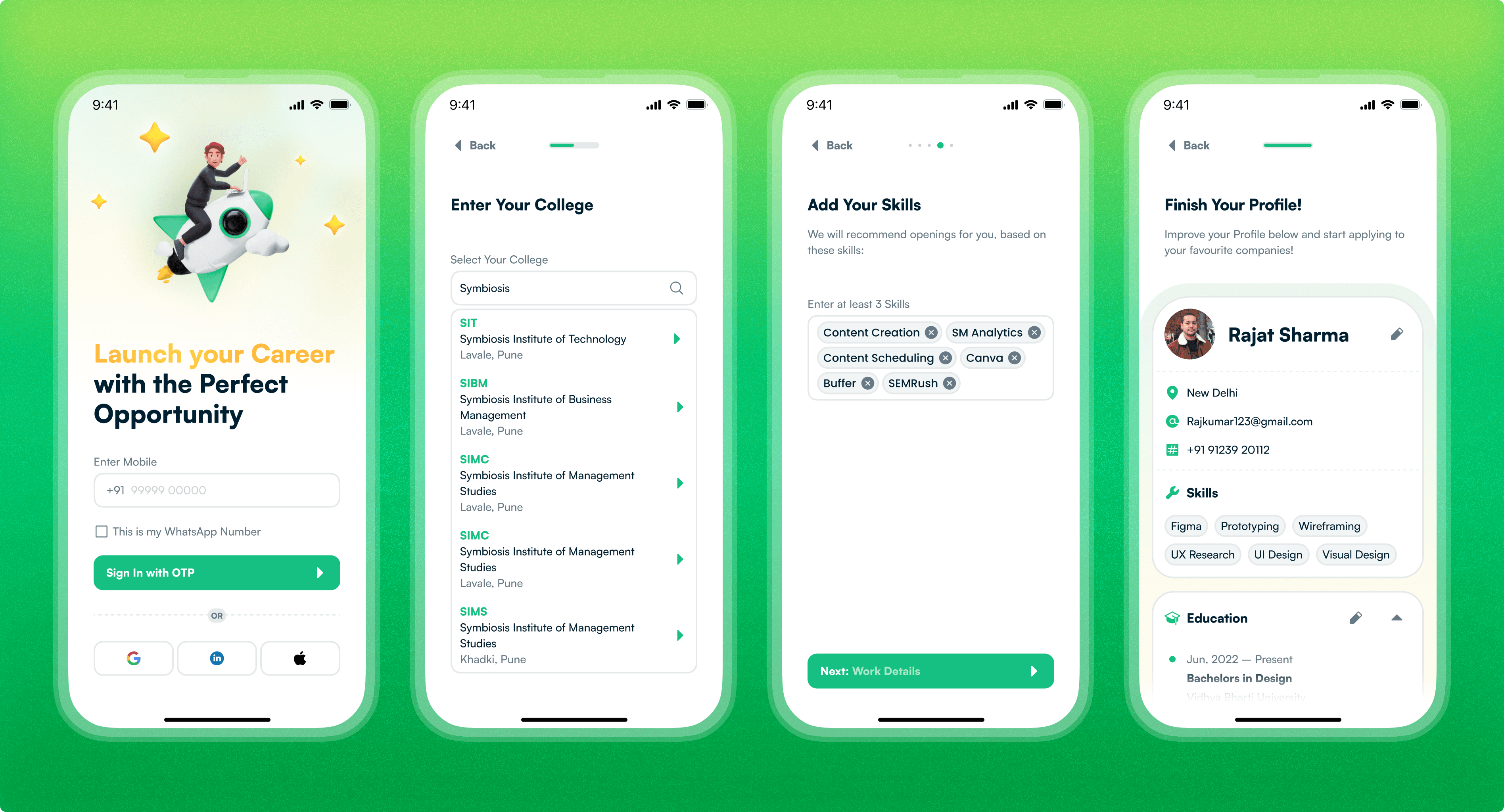
Students
Bio → in college, is about to enter the job market, exploring all options to learn and get work experience. At this stage, a defined career or direction is less prevalent.
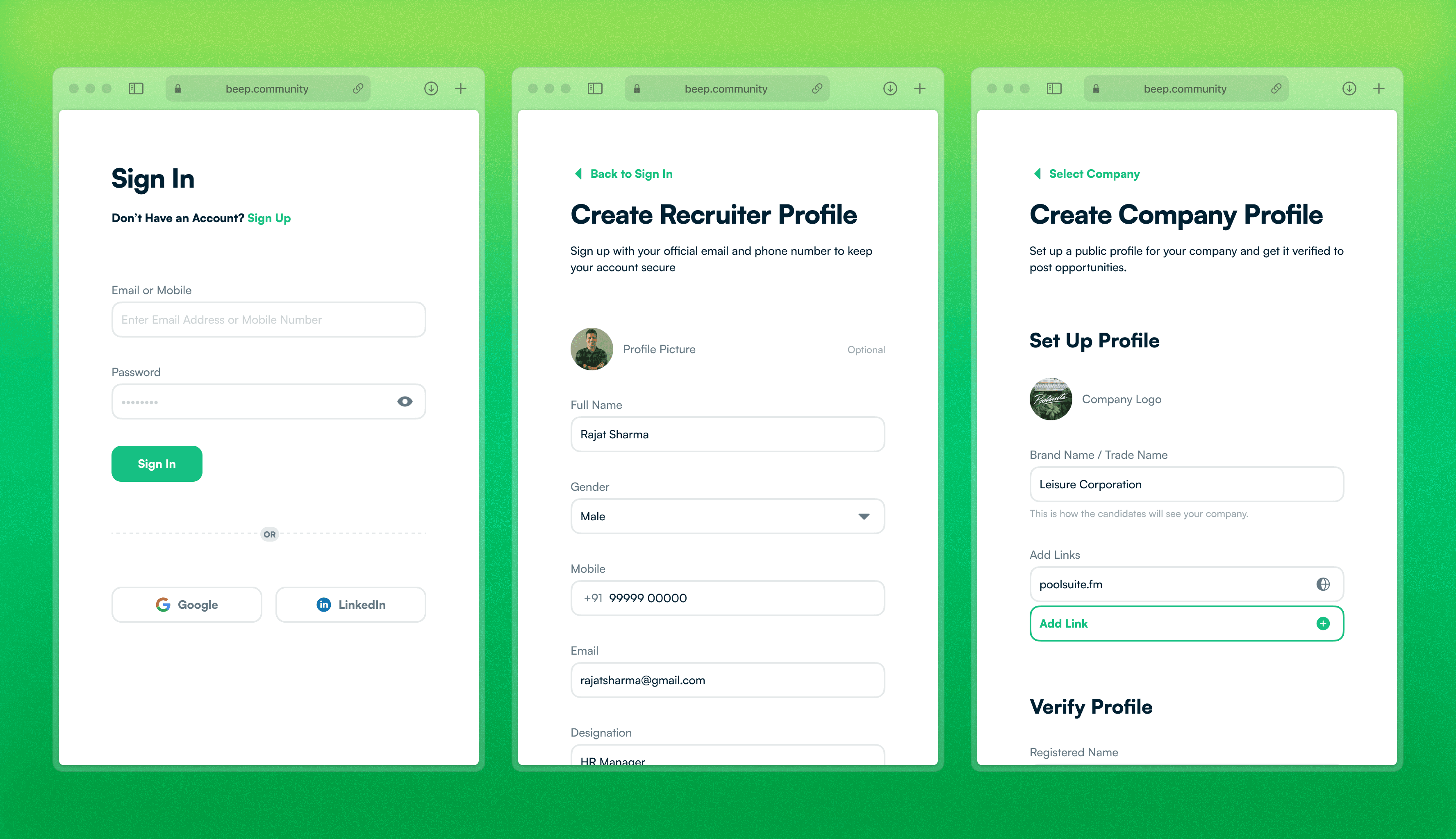
Recruiters
the Competition
There are various job platforms in the market, which are functional and successful. But, after looking at various platforms, one platform stood out as the most relevant comparison, while being successful i.e. Internshala.
They target a similar audience with a product that’s already evolved and optimised for market needs. Internshala’s blueprint became a good starting point for our Layer 1 MVP.

the Product Map
With our inputs aligned, we mapped out the product structure, which would inform the designs for an MVP and further updates.

the Student App


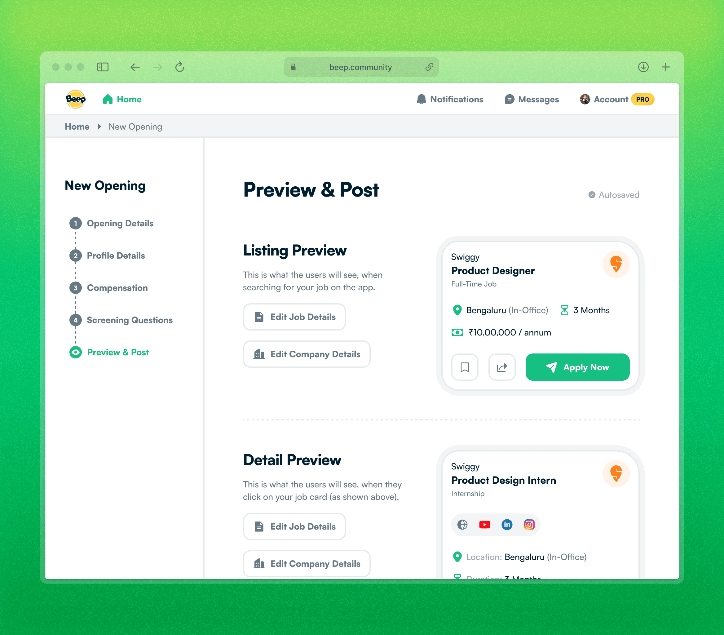
the Recruiter App


the Wrap Up
After shipping the MVP, we pushed several updates to remove bugs and improve the features. It was evident that the users are not looking for the perfect product, but a product that does the job with the least friction. To create a friction-less experience, various technical aspects of the product were also fixed and improved.
Those updates will be added here shortly...
With our work on L1 finalised, our focus shifted to L2, the Content Layer. This needed us to think on a different note altogether.
Conclusion
Writing up Next
Layer 2 → Content
The transition between a simple job platform into a community.
Layer 3 → Community
The most in-demand requirement from existing student users.
Beep Design System
The process of collaborating & scaling the design across platforms.
Thanks for Reading
This case study showcases our key work at Beep, while ignoring the pedantic details. As mentioned above, we will be adding more details here shortly.
To deep-dive further into our thought process or work with us on your project, feel free to reach out to us.